So, what’s new?
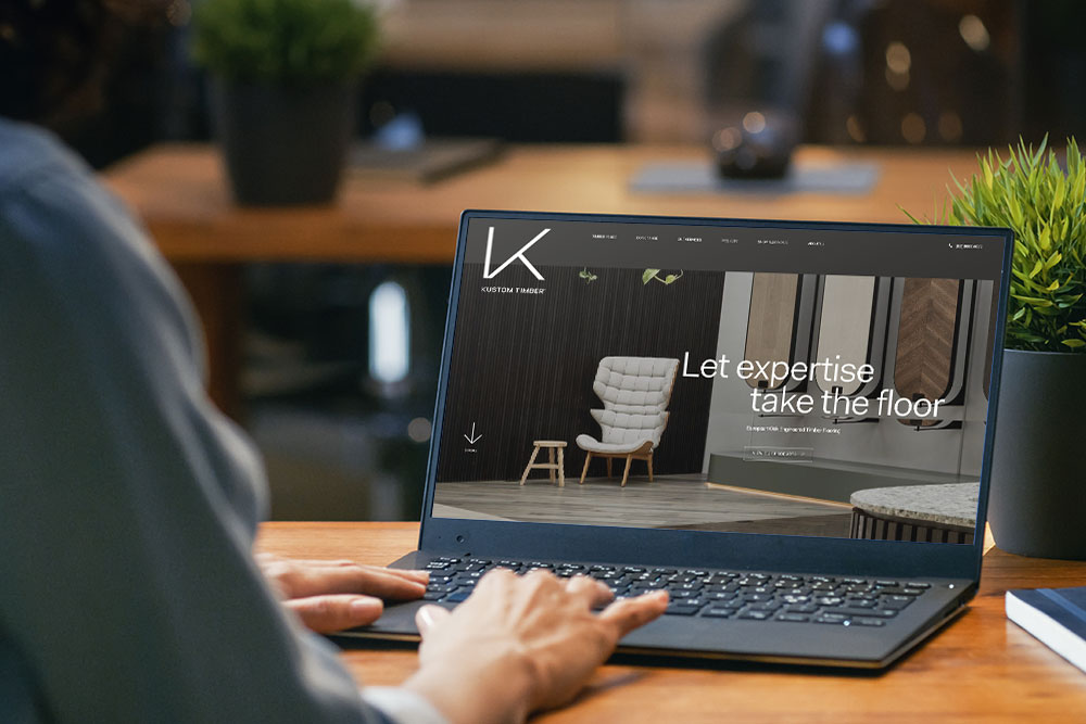
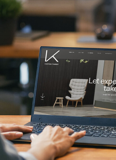
We really wanted to strike a balance between form and function. Our new website is sleek, modern, and sophisticated, all while beautifully reflecting our premium product and skilled craftsmanship. Improved user experience was key for us, and we wanted to make sure the new website was visually striking while also being responsive and seamless when it came to the navigation.
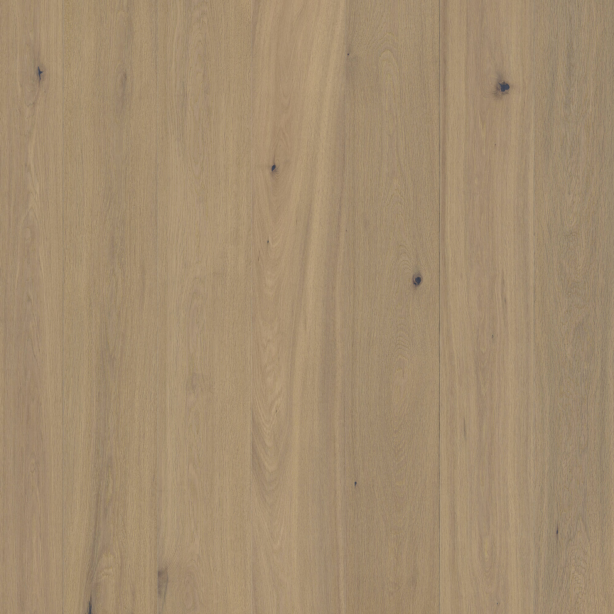
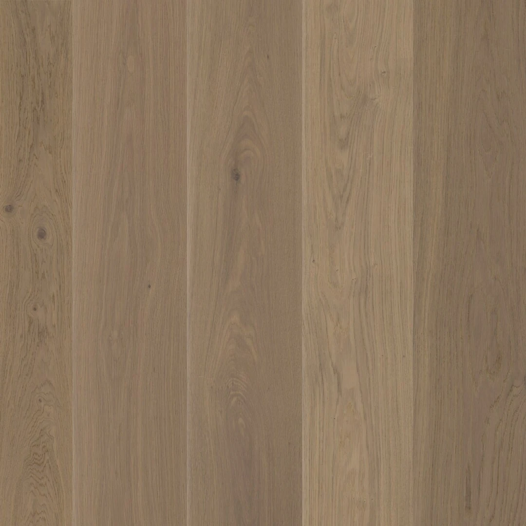
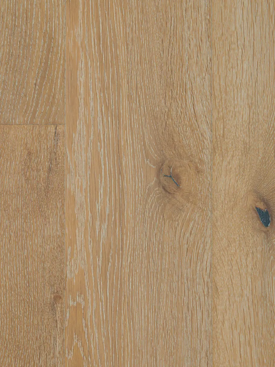
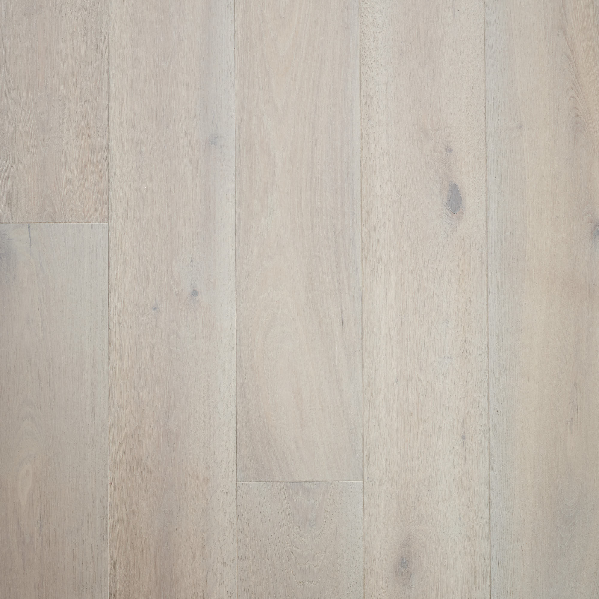
We know that your time is valuable, and we want to make sure you can find exactly what you’re looking for within a matter of seconds. Our new search and filter function allows you to search our range more effectively, with the ability to filter by colour, grade, width, length, and plank thickness. Whether you know exactly what you’re after or you’d prefer to scroll through and see what catches your eye, you’re now able to do both.
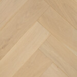
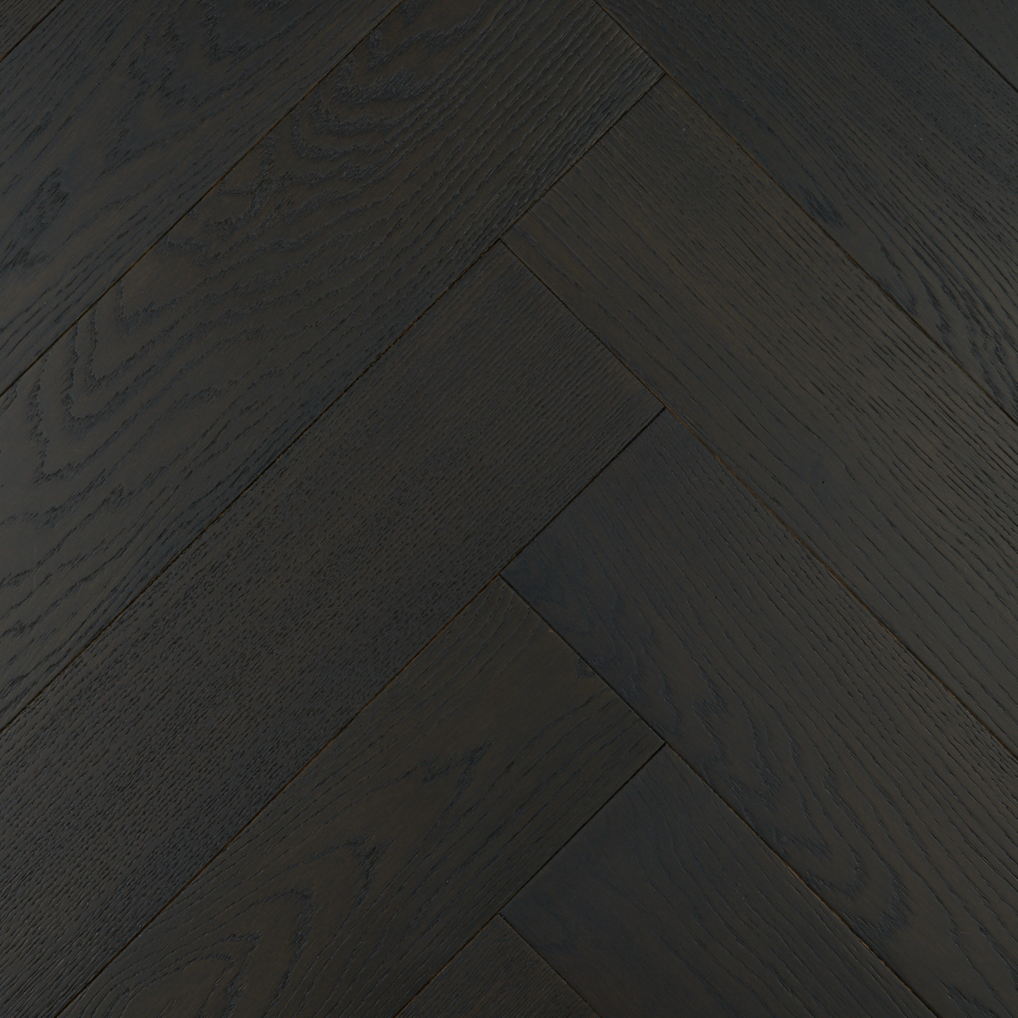
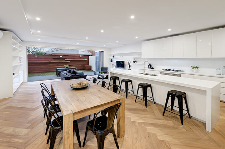
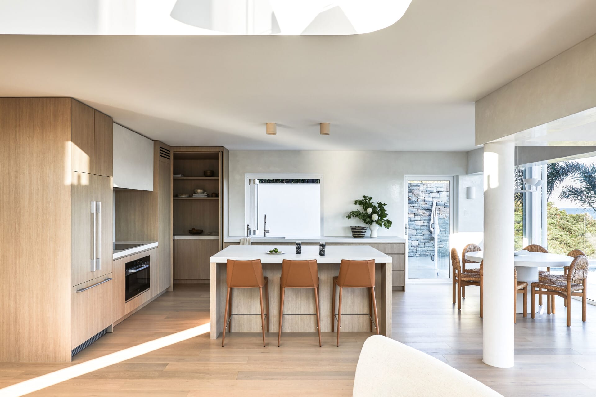
When it comes to interior design, visuals are always key, and we wanted our new website to be a visual experience. Our engineered timber flooring speaks for itself, and we wanted the stunning imagery from our projects to shine through. So you’ll notice that our project photography takes the spotlight it so deserves.
We also know how much everybody loves seeing projects we’ve worked on, and we’ve further developed these pages to truly showcase each beautiful project, as well as give some more information about how we did it and what was involved in bringing it to life.
Have a look around!
We hope you love our new website as much as we do. Grab yourself a coffee, have a click around, and explore our beautiful range. And if you’re ready to bring your interior design visions to life, get in contact!
